Deciphering the factors behind college rankings
Introduction
For some high schoolers, college rankings hold a great deal of sway in terms of where they will apply and how they make their final decisions on where to spend the next four years of their lives. For current college students, besides being the kindling for some light-hearted rivalry, college rankings can be the justification upholding pride or the scarlet letter proclaiming shame and regret. A few months ago, US News unveiled their 2019 ranking of national universities, in which they ranked UCLA above UC Berkeley, granting UCLA the position of being the top public school in the US. This unjustified fraudulent surprising turn of events made me wonder about the nature of these rankings. How robust are these rankings? What sort of school makes it to the top? What accounts for the difference between top schools and not-so-top schools?
In order to gain insight into these questions, I examined three major college rankings, selecting the top 500 schools from each ranking:
- US News Best National Universities 2019 (this list only had 312 schools, so all 312 were examined)
- Forbes Top Colleges 2018*
- Wall Street Journal/Times Higher Education (WSJ/THE) College Rankings 2019
* Forbes uses the current year to denote ranking version, whereas US News and WSJ/THE use the next calendar year when releasing their most current rankings
Taking the union of all these rankings, there are 703 schools represented here.
Ranking methodologies
Each of these three rankings provides a brief explanation of their methodology. A brief breakdown can be found here, as well as at the following links:
Some observations about the methodologies:
- Overall, these rankings all consider graduation rate, and the relative success of alumni
- While all three rely on surveys to some extent, US News places the most weight on survey results, followed by WSJ/THE, then finally Forbes places the least emphasis on survey results
- US News has the most complex methodology in that it considers the most factors
- All three rankings reward the proportion and/or graduation rate of Pell Grant students
- US News and WSJ/THE put heavy emphasis on faculty resources
- Only US News considers high-school performance, including standardized test scores and high school ranking
- Only WSJ/THE considers ethnic diversity
College features
I aimed to learn about the features of a college that best explains these rankings, beyond what these vague methodology descriptions describe. I used features the US Department of Education’s College Scorecard. The Scorecard describes almost 1900 different features for over 7000 colleges. Each of the rankings above were matched to colleges in the Scorecard. A few of the rankings featured military academies, which were not found on the Scorecard. Thus, they were omitted from this analysis.
The Scorecard contains a wide swathe of features, most of which are extremely low-level and specific (e.g. “Percentage of part-time, first-time student receiving an award within 8 years of entry”). A subset of these features were selected, filtering out most of the extremely low-level features. To this limited set, I added a small number of custom features, which serve as simple aggregates of more specific features already present in the Scorecard. For example, I added a feature that reflects ethnic diversity among students, which is simply the entropy of the different ethnic category proportions. This forms a set of 49 “high-level features”. We’ll focus on these high-level features from now on.
Agreement between the rankings
As an initial sanity check, we can see that all three rankings are very similar:
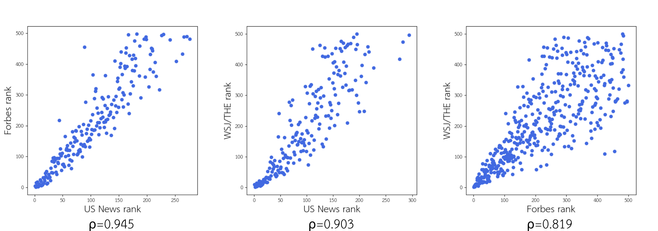
The Spearman correlation coefficient is shown for each comparison. Unsurprisingly, there is stronger agreement between the rankings when it comes to the top schools.
Correlations between features
Looking at the set of all examined schools, we can correlate the features to see which features show a strong relationship with each other. Here is a correlation heatmap for the high-level features. For conciseness in the plot, the axes are labeled with short feature names. For a description of these features, see the list of high-level features. The order of the features has been clustered to show blocks of correlation.
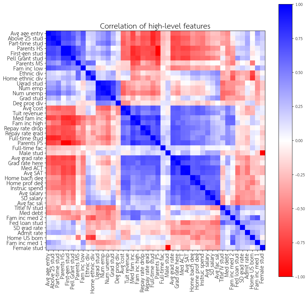
Here are some notable blocks of correlation. Schools tend to show these together:
- Low-income, first-generation students
- Lots of first-generation students (
First-gen stud) - Lots of part-time students (
Part-time stud) - Lots of Pell Grant students (
Pell Grant stud), - Lots of students with family income below $48000 (
Fam inc low) - Lots of parents whose highest education is middle school or high school (
Parents MS,Parents PS) - Lots of older students (
Avg age entry,Above 25 stud)
- Lots of first-generation students (
- Expensive schools
- High cost/tuition revenue (
Avg cost,Tuit revenue) - Lots of full-time students (
Full-time stud) - Lots of students with family income above $110000 (
Fam inc high,Med fam inc) - High debt repayment rates (
Repay rate grad,Repay rate drop) - Lots of parents whose highest education is postsecondary education (
Parents PS)
- High cost/tuition revenue (
- High-achieving students
- High graduation rate, including completion within 4 years (
Avg grad rate,Grad rate here) - High standardized test scores (
Med ACT,Avg SAT) - Lots of students who come from areas where people have bachelor’s or professional degrees (
Home bach deg,Home prof deg) - More spending of school funds on instruction for students (
Instruc spend) - High faculty salaries (
Avg fac sal) - High salaries for the working alumni, but also a high variation in salaries for working alumni (
Avg salary,SD salary)
- High graduation rate, including completion within 4 years (
Some interesting observations about these correlation blocks:
- Expensive schools also tend to have high-achieving students
- Expensive schools and schools with high-achieving students tend to lack low-income students
- Ethnic diversity (
Ethnic div,Home ethnic div) is found more in schools with high-achieving students and low-income students, but not in expensive schools - Expensive schools tend to have more Title IV students (
Title IV stud), but not schools that have many high-achieving students - Schools with more diverse degree programs (
Deg prog div) tend to have more students (Ugrad stud,Grad stud) - Expensive schools tend to have fewer students (
Ugrad stud,Grad stud) than schools with many low-income students
Correlating features to rank
Since the three rankings show high agreement (especially in the top few schools), I correlated each of these high-level features to the average rank (over all three rankings).
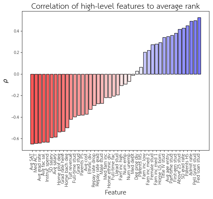
Note that on the left, red means that increasing that feature improves the rank (makes it smaller). On the right, blue means that increasing that feature worsens the rank (makes it larger).
Some top predictors for good rank:
- High standardized test scores (
Med ACT,Avg SAT) - High graduation rate, including completion within 4 years (
Avg grad rate,Grad rate here) - More spending of school funds on instruction for students (
Instruc spend) - High faculty salaries (
Avg fac sal)
Some top predictors for bad rank:
- Lots of students who receive a Pell Grant or federal loan (
Pell Grant stud,Fed loan stud) - High admissions rate (
Admit rate) - High variation in graduation rate across different ethnicities (
SD grad rate)
A somewhat surprising (and a bit disturbing) observation is that having a higher percentage of male students (Male stud) is a predictor for good rank, but having a higher percentage of female students (Female stud) is a predictor for bad rank. This trend is not so simple, however, and we’ll come back to this later.
This same process was also done for each individual ranking (e.g. US News ranking only), but the results are very similar.
Reproducing the rankings via regression
Next, we peform a linear regression over the average rank over the three rankings to try and reproduce them. The rankings have their own methodologies and weights but do their methodologies best explain the final ranking? Our own regression will tell us the set of features that explain the rankings the best, regardless of the actually methodologies used to create them.
A Ridge regression model was trained on the features to predict ranking (\(\alpha = 0.5\) for the \(\ell_{2}\) regularization was selected).
Training on all low-level features, I could reproduce the average ranking nearly perfectly, with \(\rho = 0.949\). I found this impressive because of the relatively heavy role of surveys and certain complex features in the ranking methodologies, but also not too surprising because of the high correlations/anticorrelations between many of the features.
However, when the same model was trained on only the high-level features, I was still able to recapitulate the average ranks to a reasonable extent: \(\rho = 0.748\).
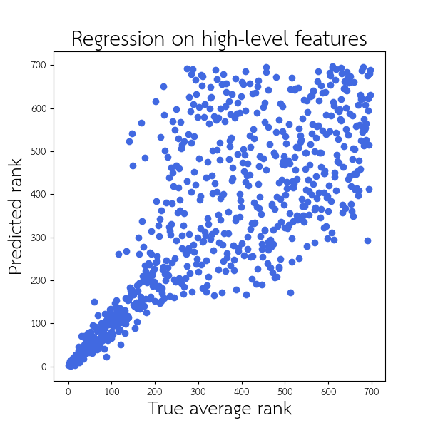
We can see that the regression performs much better on the top 200 schools. The model seems to have run into the same issue of high variance for lower-ranked schools, just as US News, Forbes, and WSJ/THE have. If we repeat the regression on only the top 200 schools, the ability to recapitulate the ranking shows a much higher accuracy: \(\rho = 0.937\). This plot below shows the result of regressing over only the top 200 schools:
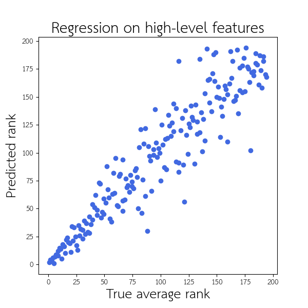
Within these top 200 schools, we were able to reproduce the average ranking extremely well. Within the top 50, our predictions are rarely off by more than 5 places or so. This performance was achieved even with a set of 49 very limited high-level features. This suggests that these features are able to capture enough of the variation in rank, so the more complex methodologies (including surveys) used by these rankings may be extraneous.
The influence of various features on rank
We can examine the weights of our trained regressor on the top 200 schools, in order to gain insight into the features it found best in recapitulating these ranks.
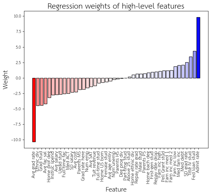
As before, red means that increasing the feature improves the rank, and blue means that increasing that feature worsens the rank.
Given the emphasis of all three rankings on graduation rate, it is not surprising that the most important feature for a good rank is graduation rate (Avg grad rate). Intringuingly, the most important feature for a bad rank is admissions rate (Admit rate), even though none of the rankings utilized admissions rate in their methodology. In fact, there are many features that were not in the ranking methodologies that the regressor found more informative than the features that were. Another example of this is the number of graduate students (Grad stud).
We also find that within the top 200 schools, there is a reversal of the gender-rank relationship we found earlier. Within the top 200 schools, a higher percentage of female students (Female stud) improves the rank, whereas a higher percentage of male students (Male stud) hurts the rank. This reversal is only seen when we limit our regression to the top 200 schools. Thus suggests within the top schools, having more female students is correlated with good rankings; in the bottom schools, however, having more female students is correlated with bad rankings.
Additionally, consistent with the finding that the percentage of students who have a Pell Grant or receive a federal loan (Pell Grant stud, Fed loan stud) is correlated with poor rank, our regressor also penalizes this feature. This implies that these the rankings themselves are best explained by giving a lower rank to schools with lots of Pell Grant students or students with federal loans. Even though these rankings were all constructed to reward the proportion and/or graduation rates of Pell Grant students, we find that having more Pell Grant students usually imparts a lower rank. This intimates at a significant (and worrisome) negative relationship between Pell Grant students and other predictors of good school ranking, despite the intentions of the ranking methodologies.
Identifying top-100 schools via random forests
Finally, let us perform a simpler task of predicting whether a school is in the top 100 (by average rank) or not, using a random forest of decision trees. This allows a coarser-grained analysis that relies on a simple distinction of “high rank” vs “low rank”. Another advantage to decision trees is that they allow the use of categorical features. Some of the high-level features are categorial (e.g. region in the US, public control vs private control, highest degree awarded, etc.), but were unable to be included in earlier analyses, which required numerical features. I used the top 100 as a cut-off, because that seems reasonable as a threshold for what we might consider a “high-ranking” or “low-ranking” school out of 703.
I trained a forest of 500 decision trees (maximum depth 5) to predict which schools are top-100 are which are not. The resulting ensemble had an accuracy of 92.7% and auROC of 0.984.
The importance of various features on determining a top-100 school
In the trained random forest, we can look at which features are the most “important” for the classification. Importance here is a rough measure how much the feature reduces the search space (i.e. how quickly it leads to a final decision).
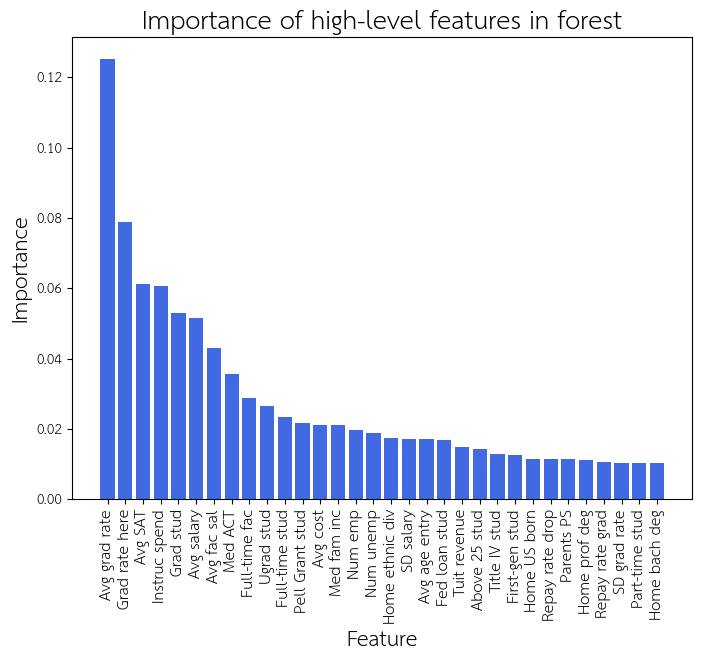
In the coarse-level analysis, we see a very similar set of features that was identified in the regression of the ranks of the top 200 schools. This suggests that the same features that are critical for distinguishing top schools from non-top schools are also critical for distinguishing top schools from each other. We continue to see graduation rate (Avg grad rate, Grad rate here), the number of students (Ugrad stud, Grad stud) (in particular the number of graduate students here), standardized test scores (Med ACT, Avg SAT), as well as salary after graduation (Avg salary).
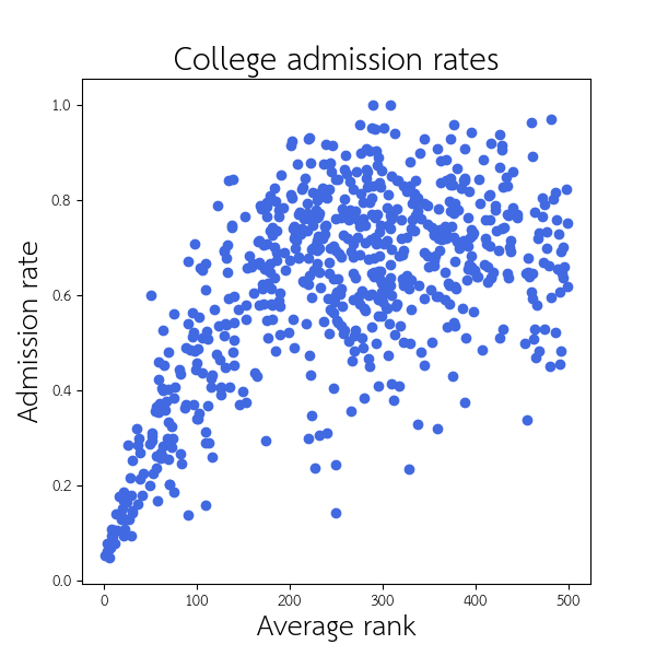
Surprisingly, admissions rate (Admit rate) is not a big predictor of being in the top 100, despite its importance in distinguishing the top 200 schools from each other. A hypothesis for the reason why is that while the schools with the highest rankings tend to have significantly lower admissions rates, the other schools in the top 100 do not have significantly different admissions rates from the lower-ranked schools (at least, not different enough to make admissions rate surpass the importance of other features).
Key points and conclusions
Key points
- While the different college rankings use different methodologies, they still show a large agreement in their rankings, especially within the top 200 schools
- When correlating various school features to each other, we identify several correlation blocks that correspond to “archetypal” schools, including expensive schools, schools with low-income students, and schools with high-achieving students
- Overall, a larger proportion of female students is a predictor of poor rank, but within the top 200 schools, having more female students is a predictor of good rank
- Even though regression captured the rankings very well, the most informative features in recapitulating the ranking were often directly ignored by the ranking methodology during construction (e.g. admissions rate or the number of graduate students)
- Although the rankings were created to reward Pell Grant students and their graduation rate, we see that the proportion of Pell Grant students is a strong predictor for poor rank
- With the notable exception of admissions rate, the same features that are the best predictors of ranking within the top 200 are also the best predictors of whether or not a schools can be considered “high-rank” in general
Conclusions
College rankings are an attempt to boil down an enormous set of descriptors to a single dimension to reflect which schools are “better” or “worse”. Different organizations may use different methodologies to describe these rankings, but we find that many of the factors they consider do not actually contribute very much to the ranking. Some factors even had an opposite effect from the intended methodology. Conversely, we also found many factors that were not considered directly by the methodologies captured the ranking very well nonetheless. In general, the ranking produced by a set of factors in a methodology is not always best explained by those same factors. The factors we care about may not be as well-represented in the rankings as we think, and the factors we might hope to ignore may be more influential than we desire.
Another important point to consider is the bias we impose on the rankings. The features used to create the rankings are human-selected, based on what that human believes are hallmarks of a “good school”. I’m certain that as I hard as I tried to be agnostic, I was also unintentionally biased when selecting the set of high-level features. Perhaps the most interesting discussion is not which school has the highest rank, but the what features are better descriptors of a “good school” than others.
While rankings look simple, they might not be so easy to interpret. It is important to step back and examine the specific factors that describe certain schools, considering the merits and pitfalls of each factor.
I guess what I’m trying to say is, screw UCLA.
Tags: college ranking machinelearning